P3- Low Fi Prototype: Part 1
For the following assignment, we constructed a prototype of our Olympic Medal database application. This page presents two unique prototypes for our application, and how each prototype handles the task of searching for data, and comparing data between two unique variables.
A general flow-diagram overview of our first prototype can be found below, followed by detailed screenshots of each individual step.
Flow Diagram 1- Searching data on a specific user:
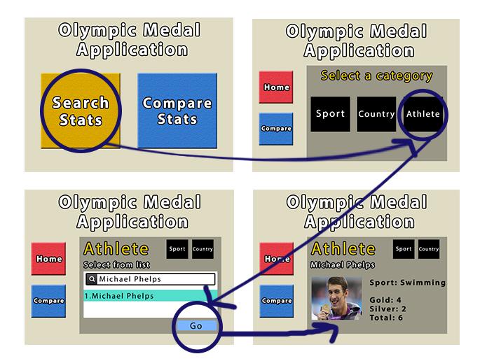

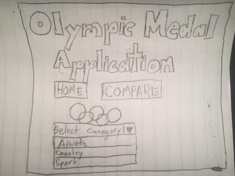
Following this, we have a new screen on the right hand side with new menu options. At this point, the user can select which specific category they are searching for. We will be selecting “athelete” for the purpose of this demonstration. It should be important to note that the main menu options can still be found as buttons on the left hand side.
At this point, a giant drop down list is brought up with a list of athlete’s recorded in our database. A search bar at the top has been implemented to reduce the number of options to scroll through if you have a good idea of you are searching for. Once a selection is highlighted from the list, you can hit the “Go” button.
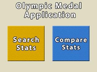
Just like last time, we first arrive at the home page. Here we have selected “Compare Stats”
P3- Low Fi Prototype: Part 2
Below, you will find our second lo-fi prototype describing the application. This was another take on the design, and is being modeled as a paper-prototype.
A general flow-diagram overview of our the second prototype can be found below, once again followed by detailed screenshots of each individual step.
Flow Diagram 1- Searching data on a specific user:
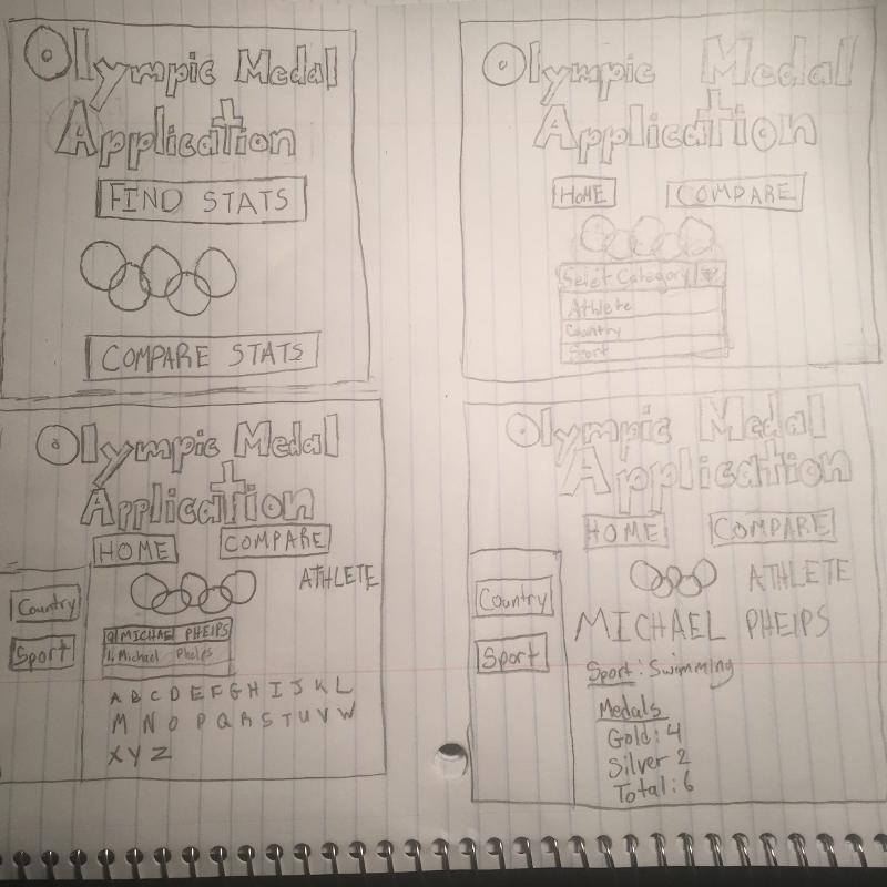
For this demonstration, we will be showing how to search specific Olympic statistics on a particular athlete. In this example, I will be a casual user hoping to learn how many medals were won by Michael Phelps during the 2012 Olympics.
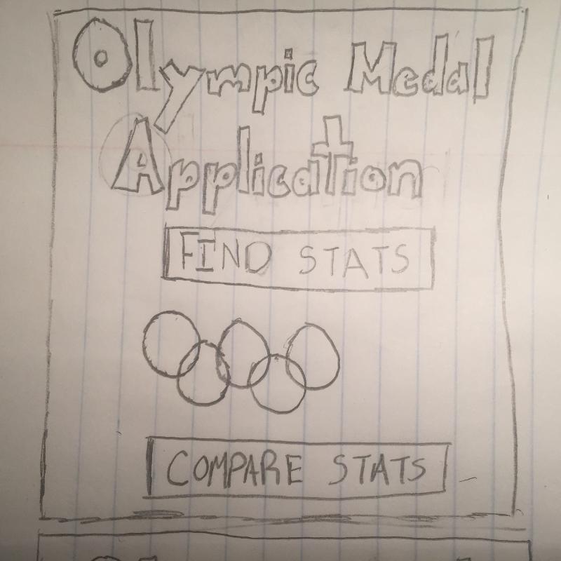
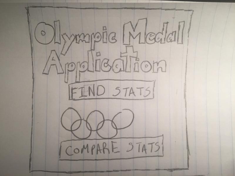
This is the homepage. Displayed on this page are two buttons which say compare stats and find stats. In between is the Olympic logo. We will select the find stats option.
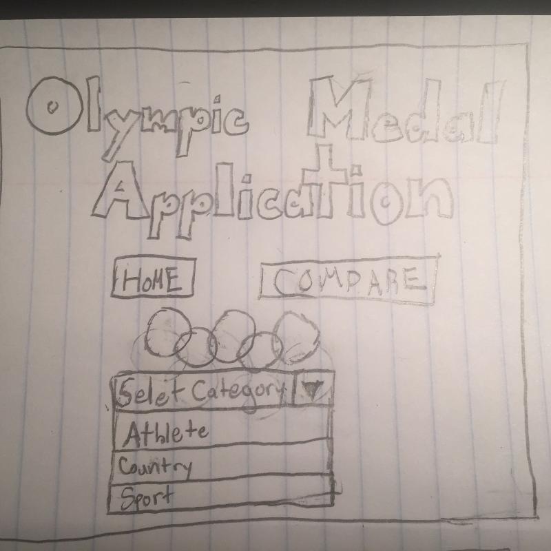
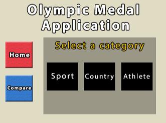
Following this, we have a new screen on the bottom hand side with new menu options. At this point, the user can select which specific category they are searching for. We will be selecting "athlete" for the purpose of this demonstration. It should be important to note that the main menu options can still be found as buttons on the top hand side.
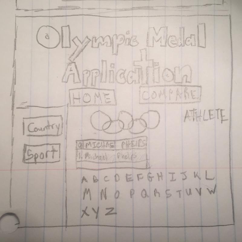
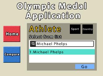
At this point, a giant drop down list is brought up with a list of athlete's recorded in our database. A search bar at the top has been implemented to reduce the number of option to scroll through if you have a good idea of what you are searching for. Once a selection is highlighted from the list, just double click the highlighted name. There are also buttons of letters where you can find your athlete by clicking the first letter of the athletes name.
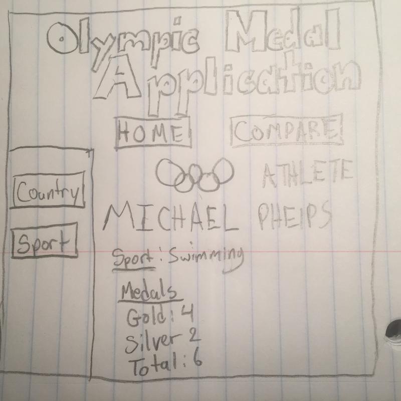
Finally this is the last stop to our search of Michael Phelps. This page shows the sport he plays and the number of medals he won. To get to the home page, click the home page on the top of the screen. Now we will move on to scenario 2.
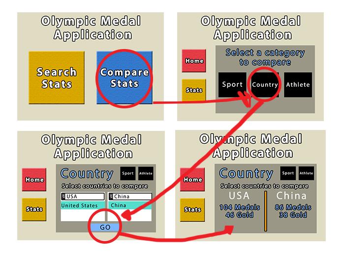
Flow Diagram 2- Comparing Two Unique Countries
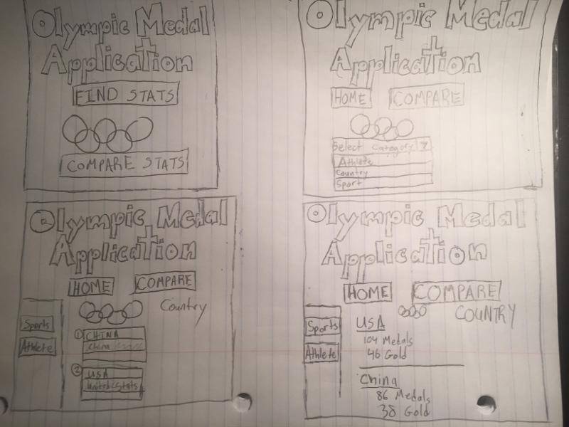
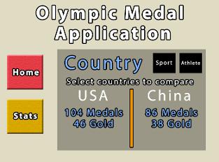
For this next demonstration, we will be showing the "compare" function of our application. Essentially, this function allows a statistical user to search the stats of the two variables simultaneously, and compare them side-by-side.
Just like the first time, we are at the homepage. We will select the compare stats option.
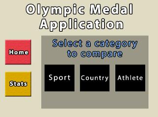
Now we have a mini-menu on the top just like before. Here we are once again selecting a category. For the purpose of this demonstration, we will use "Country".
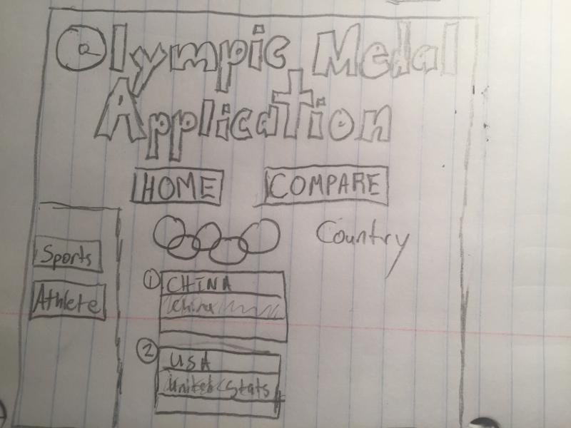
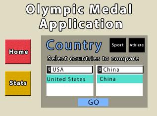
Now we have the search option to find the two countries the users wants. They can type in the countries and the search shows the result of their entry. We enter the USA and China for the use of demonstration.
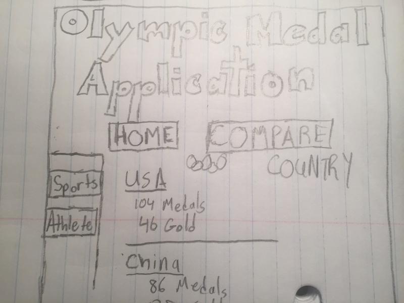
At last, we have the output of our search. Both countries are listed top to bottom with their Olympic medal totals won. They are separated by a line, which helps more cleanly separate the results.